Friday, 7 February 2014
Teacher Feedback
In monday's lesson we received feedback about our ideas of our title sequence and explained our plot to our teacher. I found this useful as after explaining our plot to our teacher, she showed us films to look into more (Such as Hide and Seek) and ideas for the production of the title sequence. After this feedback lesson we decided that our title sequence should contain contrasting scenes with the girl and the man. After being given that idea to consider, I feel as if our title sequence ideas are more structured as we know what we want for a significant part of the sequence.
I found a website called SOUNDCLOUD which allowed you to upload and share music on it, which I showed to the other people in my group to use so we could share feedback and suggestions together.
Typography for Captive
In the second half of Wednesday's lesson we begun looking at text to use in our title sequence on 'Da Font'. We decided to test these different fonts that appealed to us using our main cast's names.
Leonardo Dicaprio:


Emma Watson:


Leonardo Dicaprio:
Out of these 6 texts we looked at our group decided that we like "Old Newspaper types" and "Angel" the most and they are the two which would fit into our Thriller genre the most. We are unsure with using the "Angel" font as we haven't filmed our title sequence yet and this typography may look unclear when placed on our filming. I personally prefer the "Old Newspaper types" in general because I believe the type look text would fit into the theme of diaries in our title sequence well, however if the group make the decision with "Angel" I wouldn't mind because I believe the text fits into the Thriller genre well because it was distorted, it reminds me slightly of an influential text of SE7EN.
We believed that "Bebas" looked too a like to a comedy genre title sequence as the text is bold and eyecatching. We found the other two texts too plain for the title sequence idea that we currently have and it would look too out of place on screen.
Typography
- Zombieland (2009)
- Catch Me If You Can (2002)
- Forrest Gump (1994)
- Lord Of War (2005)
If our group was to take any influence of any of these title sequences it would most likely be 'Lord Of War' as we are looking to use point of view into our title sequence and the use of point of view camerawork has been done really well in that title sequence.
We also looked into Serif and Sans Serif during the lesson and the differences of them.
Serif: A small decorative flourish on the end of the strokes that make up letters and symbols.
Sans Serif: Fonts which do not have any flourishes at the end of strokes.

The typography in title sequences can be used to create the tone of the sequence in some occasions. For example when looking at Forrest Gump, the text was white and in a Serif font. This created a more calm and relaxing feel towards the film. The text was also contrasted to a feather on the screen whilst the text fades in and , which could connote the text being light and simple like a feather.
Journal
On Friday's lesson last week we started our storyboarding and continued it throughout this week. Me and my group have found this part very hard as we seem better when explaining it vocally more than through draws, we wrote down some key points and tried to start creating our storyboard using them. Last friday we begun making small doodles of our storyboard ideas.
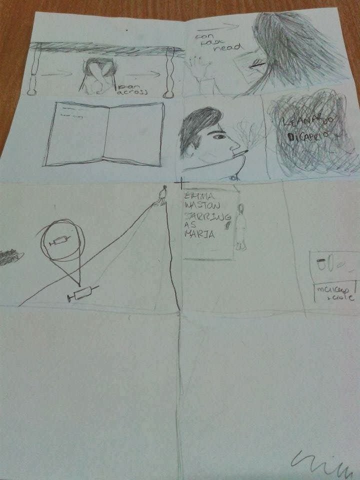 When stuck on ideas on how to create our storyboard we begun watching previous AS title sequences and counting the cuts of them to get a rough idea of how many drawings we would need. We decided roughly that we needed between 25-40 cuts in our sequence.
When stuck on ideas on how to create our storyboard we begun watching previous AS title sequences and counting the cuts of them to get a rough idea of how many drawings we would need. We decided roughly that we needed between 25-40 cuts in our sequence.
We was also introduced to the equipment needed for the production of our title sequence, we decided as a group to use the steady cam for our recording as some of our title sequence will be filmed in smaller rooms which a tripod or dolly could fit in.
Our group also decided what input we are all putting into the making of the title sequence
- Me: camerawork, we decided this because I am perhaps the shyest part of our group and have previously done recording and know the camera shots well due to doing Media Studies in GCSE aswell.
- Sophie: Voiceover, we thought Sophie would be ideal for the voiceover as we previously used Sophie's voice as a voiceover at the beginning of the year and her voice is most likely the most mature out of the 3 girl's voices in our group.
- Christian: The stalker/doctor, Christian currently does Drama AS and did Drama GCSE last year and fits well into our idea for our stalker in the title sequence (tall, well dressed etc).
- Megan: The 'captive' girl, Megan had also done Drama GCSE last year so is confident in front of the camera. Megan also has blue and bright eyes which would also be ideal for the close ups of eyes used within the title sequence.
Overall, I feel as if each of us fit into our roles well and this makes me confident with our production as each of us are most likely placed in our strongest positions.
Monday, 3 February 2014
'The Girl with the Dragon Tattoo' title sequence timeline
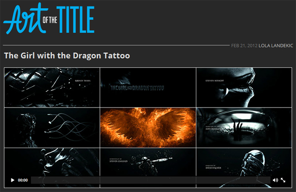
A few weeks ago we was asked to make a title sequence timeline in lesson, however when doing this in class I begun recording the timeline for the ending credits to a film from Artofthetitle. I am now doing a basic one on a film selected on my survey so the timeline could perhaps be an influence to my title sequence. The film I choice was The Girl with the Dragon Tattoo. I found the trailer slightly similar to SE7EN due to how dark it was. I like how all the onscreen was in black and white apart from specific things such as fire. I definitely want to fully analysis this piece of work to use as influence towards my title sequence. The sequence is simple but also effective due to the use of colour which we could take into interest when making our own.
This is my basic timeline of the text on screen:
This is my basic timeline of the text on screen:
0:00:00
0:00:08
Production companies
0:00:17
The names of the main cast in the film
0:00:22
The title of the film
00:00:26
Other significant actors/actresses names
00:01:15
Casting by
00:01:20
Costume designer
00:01:23
Co-producers
00.01:26
Sound design
00:01:29
Music by
00:01:31
Editors
00:01:34
Production designer
00:01:37
Director of photography
00:01:46
Executive producers
00:01:50
Produced by
00:01:53
Based on book by / originally published by
00:02:09
Screenplay by
00:02:21
Directed by
NO MORE CREDITS FROM THIS POINT
00.02.34
Title Sequence ends
I think this is a suitable timeline for my group's title sequence, although the title sequence is too long but could be shortened down for us because of our lack of actors/actresses in it. Our title sequences needs to be no longer than 2 minutes but this title sequence went through a significant amount of actors and juxtaposed fast pace cuts with slower ones to create dramatic suspense.
Subscribe to:
Comments (Atom)