Friday 24 January 2014

Re-done brainstorm of our first title sequence ideas


I re-made the brainstorm we made in lesson on Bubblu.us as I liked the way our other brainstorm came out on this website, writing it out on an online brainstorm maker makes it a lot more clearer and it was nice to refresh my mind on the ideas we've made.

Journal

In Friday's lesson we begun to plan out our title sequence for our film. We spoke about:

  • Distributor and Production Company
  • Style
  • Camerawork
  • Genre
  • Style and Editing
  • Text on screen
  • Narrative
  • Setting
  • Make-up and props
  • Characters
  • Sound


We started this brainstorm by starting with 'STINCS'
Setting - Theme - Iconography - Narrative - Characters - Style

After doing so we decided to look into other stuff to conclude as a group together. We then did some research on 'Kidnapping vs Medicine'. We thought we should use needles as they can represent illegal drugs to knock somebody out but they can only be used to cure someone from a deadly illness.
We started looking at restraining tools such as handcuffs and perhaps ropes.

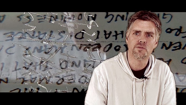
From this point we decided to maybe consider setting this back to around the 1960s when mental illness was treated differently and more horrific. We started researching how schizophrenia was treated before people had prescripted drugs. We found out about prefrontal leucotomy, when doctors used to remove the part of the brain that released emotions. From looking at this we begun to think setting our film would fall too much into the horror genre as it is quite gory and a horrible thing to think about.

I feel as if this lesson was a massive jump for our title sequence ideas, I feel more confident with making the sequence and feel like it can work really well.

Kyle Cooper

As my group did a group analysis of the title sequence SE7EN, I decided to look at the creator of the sequence, Kyle Cooper.

Kyle Cooper was born in 1962 and went to Yale University to gain a degree in Graphics Design. Cooper founded the creative agency 'Prologue'. Prologue initially located in Malibu, moved to offices in Venice Beach in Los Angeles in 2008 due to his success.

Kyle's biggest piece of work was the SE7EN title sequence which made him gain a lot of work after this 1995 film.

He has done the title sequences for films such as:

  • The Mummy (1999)
  • Spiderman (2002)
  • Dawn of the Dead (2004)
  • Superman Returns (2006)
  • Ironman (2008)
  • Sherlock Holmes (2009)
From this it seems that Cooper grew a taste in creating the title sequences for Superhero / Marvel Films.

Cooper also did title sequences for TV shows such as:
  • The Walking Dead
  • American Horror Story
I think Kyle Cooper is more of an influence for our group than Saul Bass' title sequences are. Cooper's title sequence are more modern and fit better with Thriller, Action and Horror films when looking at the work that he's done.

Production company design / logo

During Wednesday's lesson we was asked to create a production company and a logo for this production. As a group we decided to make a Thriller production company called 'Silent Studios'. We decided to call it Silent Studios as Thrillers usually do not give away the twist of a film until the end to keep the audience motivated to watch. The use of 'silent' also fits well with our film idea 'Captive' as our film has a big plot twist at the end of the film and isolation is significant part to this film.


These are the two logos we came out with for our production company, we decided to darken the logo to make the text more involved with the image. I like this logo as it's mysterious but can easily be recognised to be more a Thriller or Suspense film. The logo is dark which also connotes that this company is for Thriller films. We decided to use a finger over lips to stereotype secrecy in these kind of films this company produces. The image is quite faint and is not that noticeable unless you are really looking at the logo. The text is meant to look eroded and broken but despite it not looking like that as much as we wanted, I like the text that we have used on our logo.
 
I made these logos on Photoshop CS6, I found these easy to make as I currently also do Graphics Design in AS so if we come out with a better idea for our logo it wouldn't be an issue to change.

Thriller genre survey

Click here to take survey

I have made a surveymonkey on thriller genre to collect data to see what other people think towards the genre i'm doing my coursework on, I have included age and gender to see what the ideal target audience would be for us.

When clicking the link above you will be able to take part with the survey, it is an annoymous survey


This is a screenshot of the survey, there is currently only 6 questions on it but I may make another one if I get a few responses on this one.

Group Analysis of the title sequence of Se7en


Camerawork: At the start of the title sequence this a straight angle shot of a plain book and you see pages of the book being slowed turned over, next there is a high angle shot, which the audience can see a pair distorted drawn hands on some paper so there is a clear view of the scene telling the audience that there is something creepy to follow in the film. After this there is a extreme close up at a straight angle shot of fingers and someone slicing the skin off them, this creates uncertainty and mysterious about what the film will unravel. In addition there is a mix of shots shown some include books and paper.Furthermore we shown at a canted angle someone writing with a pen on paper then the shot changes to a close up, straightangle shot of the writing to the camera. Then someone cutting up images and paper is shown from a high angle shot so the audience can see the whole scene so they can try and guess more what the film will in tale. Just under half way through the title sequence a side shot of someone writing again is shown and a shadow of a hand is seen through the paper, it adds to the mystery and suspense of who this person is because we never see any facial features at this point. Throughout the sequence a black background with white text pops up on the screen of which lists cast members and crew at canted angles and in different places at each time it appears.
In addition the same shot from the start of the title sequence is shown which is of the plain pages of a book being turned at a straight angle, this could be hinting to the audience this a common thing this person does. As the title sequence continues there are more shots that appear and fade into each other at a quicker pace we see again see drawings and writing by the person. At 01:38 minutes through the sequence another extreme close is shown but this time of a needle going through a thumb and to the disturbance the audience will already be feeling.
Mise-en-scene: The camera movements and angles in this title sequence are varied but all add to the effect of this film being in the thriller genre and makes the audience feel excited and disturbed.
At the start of the title sequence the first thing you see is a book with the hand turning the pages. The lighting gives a dark gloomy feel to the sequence. Then we move onto the drawing of the deformed hands which is in black and white with a light shining through perhaps a window or a door. We see an injured finger rolling something. We know it’s injured because there is a plaster on the human’s forefinger. The human is using a blade to cut off his finger prints. This suggests that he is quite a sadistic person and that crime may be the story line for this film.

Dirty nails are shown to us to perhaps let us know that he is artistic. We might think this because of the drawing of the hands. At this point of the title sequence there are flashes, and in one of the flashes we see a picture of a deformed baby it looks like, with its nose, lip and eyes distorted. This could give away that he might not be a regular person. After this, we see the person writing in a book perhaps a journal. There is film and paper being cut. Pictures are being stuck down on a piece of paper. A book about pregnancy is altered by the person crossing out words in a black highlight pen. Now the title sequence gets a bit sick as the person crosses out the picture of a boys eye suggesting from the distorted baby’s picture that the person likes to see/do things that are distorted.
A little more than half way through the title sequence we see that he has picture equipment as we see him dip the picture in the liquid. The colour of the background changes from black to red. We see hooks. The book at the beginning is shown repeatedly throughout this title sequence. A needle is shown coming out of the person’s fingernail. We see thread going through a needle. We see a plastic envelope which the person put something in it with tweezers and a scalpel to cut out the text ‘GOD’ from a dollar bill. Throughout this title sequence a sinister feel is created by the props it used for example the different pictures of distorted/injured people and the change in colour. Red connotes danger and blood.
Sound: The title sequence of se7en includes of a lot of distorted noises, most can be made out to be faint voices. The distorted sound suggests danger or perhaps supernatural appearances in the film. As the fingers are shown being cut across the sound of the scrapping is emphasised and is continuous when the shot is finished, the continuous scrapping of the skin creates a sense of discomfort for the audience and may be connoting that there is a never ending stream of death or torture in the film. Cracking noises that could be linked with the distortion of the title sequence are made. ‘Walkie Talkie’ signals are heard, this gives away to the audience that this is a police detective thriller. 

Throughout the whole sequence there is a frequent cranking like noise with a slightly unstable noise, it sounds similar to a squeaky bed but been edited to be more high pitched. The cranking noises may tell the audience that the film is building up to a big finale. The cranking noise is in sync with the pages and the writing which could mean that the person in the title sequence is plotting ideas in this book with the unclear text.
Mysterious but more upbeat is played over the current sounds, this gives the feeling of suspense for the audience. It then slowly develops into a rock music genre which creates a sense of violence towards the film. A rock influenced song may of been used to connote aggression in the film and high amounts of action. The music goes back to distort and the words “You get me closer to God” is said to show that biblical references may be made in the film. The scene then ends with faint breathing which may be a foreshadow to a bad ending to the film. Overall, I believe Kyle Cooper has used all these sounds to make the audience uncomfortable but attached to what's going to happen in the film.


Codes and conventions of Thriller genre


After Wednesday's lesson we was asked to research the code and conventions of our chosen genre.

Monday 20 January 2014

Saul Bass


Also in Wednesday's lesson we researched about Saul Bass himself. Saul bass was born in 1920 and passed away in 1996 and his work is still an inspiration to title sequence designers. Originally, Saul Bass was a Graphics Designer and studied part-time at the Art Students League in Manhattan. He then begun making Film Ads in the 1940s, eventually he met up with a filmmaker called Otto Preminger to design a film poster for his 1954 film Carmen Jones. Otto Preminger asked Saul Bass to create his title sequence aswell as he was so impressed by the work he produced for him. Bass was one of the first people to realise the the art within the opening and closing credits of a film. Saul Bass' work is known to be unique due to the hand drawn and casual appearance he makes with his sequences.


Saul Bass became well known after his title sequence for 'The Man with the Golden Arm' in 1955. Saul Bass then begun doing work for Alfred Hitchcock. He did the the title sequence for his films:

  • North By Northwest (1959)
  • Vertigo (1958)
  • Psycho (1960)

As he got to the end of his career, he was rediscovered by the famous James L. Brooks and Martin Scorsese as they had admired his work as they were growing up. Saul Bass then created the title sequence for the well known films:
  • Goodfellas (1990)
  • Cape Fear (1991)
  • The Age Of Innocence (1993)
  • Casino (1995)

Saul Bass: Title Sequences


In wednesday's lesson we was looking at Saul Bass' work in lesson and examples of how Saul Bass has influenced other people's work. In lesson we watched 'The man with the golden arm' and were picking out how the sequence is relatable to the genre. For example, considering the film contains use of drugs, the white lines may could be trying to suggest the drug use in the film. We also looked at 'West Side Story' with the use of the lines for 5 minutes to create the city at the end. Saul Bass uses colour in that sequence which made it different to 'The Man with the Golden Arm' and the sequence i've begun looking at, Psycho. The colours were bright and created a feel of 'fairytale' and a happy atmosphere which 'The Man with the Golden Arm' didn't do.

Saul Bass' work is easily recognisable due to the lines and pale pastel colours he uses. The lines always flow smoothly throughout the sequence and keep the audience attached to the lines. Saul Bass' work is still a huge influence to title sequences today. For example, Monsters Inc (2001) is influenced by Saul Bass' work with the ongoing lines to make shapes and patterns to make the doors. The Monsters Inc title sequence made by Susan Bradley works well and the Saul Bass influence is noticeable.


After Wednesday's lesson I begun looking at another Saul Bass title sequence, Psycho. Psycho is a horror film from 1960 which is still highly popular. The title sequence is very similar to 'The man with the golden arm' as simple lines are used. In this sequence, dark grey lines are used. In the sequence, it's like the arms are chasing after the text on the screen which relates to the film well. The dark grey lines could also suggest prison aswell as the lines can be seen to look like cell bars. The only time imagery is shown is at the end of the sequence when the film's setting is shown to be set in the city.


Napoleon Dynamite Analysis


The sequence begins with a plate with chicken nuggets and ketchup being placed onto a red carpet, on the plate is ‘Fox Searchlight pictures’ written onto it. The plate is left for about 3 seconds and took away, the clip then cuts to a fluffy lime carpet with a plate being placed with a burrito and rice on it, ‘and Paramount Pictures present’ is written onto this plate with mustard. Again, the plate is taken away and the clip cuts to a different carpet, this being a blue carpet with a plate placed on it with boiled eggs circling the text ‘in association with MTV Films’.

The plates are now stopped and we are shown a point of view shot of a person opening up a wallet, the wallet is organised and we get a ‘nerd’ feel for this character as they have a ‘U.F.O Abduction Insurance’ in their wallet. Some kind of ID is brought out of the wallet after which says ‘Preston High As Napoleon Dynamite’. The sequence then goes back to plates; it is placed onto an astroturf which suggests the film may be taken place in a school. A piece of meat is placed on a place with ‘Jon Gries’ on it. The clip is cut to a yellow/orange threaded carpet which suggests that the film may be set a decade or two behind as carpet like this is no longer used. Nachos with cheese are placed on a plate with ‘Aaron Ruell’.
 
A tray with peaches, corndog and peas in placed on green vinyl floor; the tray may also suggest the film-taking place in school as trays are commonly known for being at school lunchtime. The corndog has ‘Efren Ramirez’ written on it. The next clip backs up my theory as a packed lunch is brought out, a sandwich and a banana. ‘Tina Majorino’ is written on the sandwich. The plates have now stopped again and there is another point of view shot of a ninja blade made out of tin foil, this suggests an imaginative and playful character. The blade has ‘with Diedrich Bader’ typed onto it. The text looks similar to a typewriter font, the blade is then flung out of the shot. The next shot begins with the hands opening a cook with taking out a library slip which says ‘casting by Tony Weith’. The title of the book, which was taken out, is ‘Bigfoot and Me’ which suggests the character likes supernatural topics as he has an interest in aliens and mythical creatures. A second book is opened and another library slip is taken out, this one saying ‘music by John Swichant’, at the top of this library slip the book’s name which was checked out on this slip is ‘Sciences and Centaurs’ which backs up my idea of interests with mythical creatures.

An empty sweet box is placed onto wormy brown carpet, the packet says ‘Edited by Jeremy Coon’. The use of the sweet packet may suggest the character is still childish; the packet is flicked off of the shot. A focus pull is then quickly used afterwards showing a lipbalm with ‘Production Cory Lorenger’, this shows the character is quite nerdy and neat.
 Hand drawing of a medieval man is placed in the shot with the flag saying ‘director of photography Mumn Powell’. A second hand drawing is then placed of a medieval woman battling a bird, this drawing has ‘executive producer Tony Weits’ written on it. These drawings are done on lined paper, which suggests that they were quick doodles done in lesson. We are then shown 3 toy cars stucked away with names underneath written in labelling tape. Above this in the same tape is ‘Produced By’.


A protractor, rubber and 3 pencils are placed onto the shot and the pencils are organised carefully by the hands showing that the character may be a bit of a perfectionist. The rubber has ‘written by’ on it and the pencils underneath have ‘Jared Hess’ ‘And’ ‘Jekusha Hess’ written on them. The stationary is then aggressively swiped off the shot.

The sequence once again goes back to plates, this place has a burger and chips on it, which could suggest the sequence is showing a day of this character, and his dinner is now being shown, rounding up his day at school. This plate has ‘directed by Jared Hess’ on it. The sequence ends with the hands smacking the bun onto the burger.

The music is the same throughout the sequence after the first three plates. It is a calm acoustic song which could suggest a calm character.  The song says ‘I can tell that we’re going to be friends’ which could suggest a boy’s first day at school.